
Vladimir Lifanov / Ilya Lazuchenkov / Egor Myznik
Denis Shlesberg / Erken Kagarov / Sergey Rasskazov
Denis Shlesberg / Erken Kagarov / Sergey Rasskazov
What is Russian tourism brand about?
Vladimir Lifanov / Ilya Lazuchenkov / Egor Myznik
Denis Shlesberg / Erken Kagarov / Sergey Rasskazov
Denis Shlesberg / Erken Kagarov / Sergey Rasskazov
What is Russian tourism brand about?
Russia is tremendous and vast. It has everything one can imagine: from subtropical to Arctic regions and climates, from the deepest lakes to the highest peaks. The truth is, Russia is not only huge in sheer size, but in other aspects as well – it stretches from the past to the future, comprising multiple cultures and preserving thousands of stories and memories. Traveling across Russia is more than just a travel. It is an endless discovery!
Russia is tremendous and vast. It has everything one can imagine: from subtropical to Arctic regions and climates, from the deepest lakes to the highest peaks. The truth is, Russia is not only huge in sheer size, but in other aspects as well – it stretches from the past to the future, comprising multiple cultures and preserving thousands of stories and memories. Traveling across Russia is more than just a travel. It is an endless discovery!
The Whole World within Russia
The Whole World within Russia
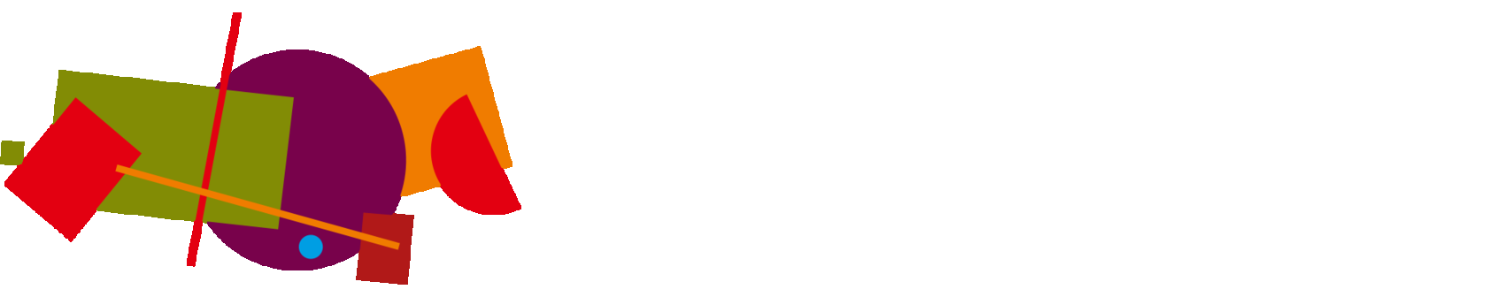
Why suprematism?
A tourism brand and its symbol need time for people to familiarize with them and for the right associations to begin shaping. Suprematism – one of the directions of Russian avant-garde artistic movement – originated in our country in the early 20th century and represented advanced thinking, not only on the scale of Russia, but for the whole world. This cultural phenomenon stood the test of time to evoke strong associations with Russia, and today serves as its icon in visual aesthetics. The Russian tourism brand's graphic solution is a stylized map of Russia. The map's elements represent our country's specific places and territories, convincingly communicating its character and depth.
Russian culture
Russia's impact on human culture is limitless. It gave the world the talent that created masterpieces in literature, art, classical music, cinematography, architecture, theater, and ballet. Our national identity is reflected in folk music and dance, legends and tales, and traditional arts and crafts. These things all find a place in the new tourism brand identity.
FIFA World Cup
Russia will host the FIFA World Cup in 2018, and for the first time, the event will be held simultaneously in both Europe and Asia. It will also be the first time that Russia has organized such a large-scale football championship. Newly built stadiums in eleven cities will host fans from around the world. No doubt, it is going to be a major sport celebration that people will remember.
Local cuisine
Russian cuisine has been developing for centuries by absorbing elements of various ethnic culinary traditions, making it richly multifaceted. Traditional dishes from the Russian north have little in common with ones from the Volga region; Siberian cuisine is different from that of Moscow. Therefore every guest of our country will find something that suits his or her taste.
Nature
Russia's nature is known for its beauty but in some cases it is entirely unique. Arctic regions, tundra, the taiga, endless forests, prairies, wooded steppes, deserts, mountains – Russia has it all. Its diverse nature, flora, and fauna stir the imagination.
Russian culture
Russia's impact on human culture is limitless. It gave the world the talent that created masterpieces in literature, art, classical music, cinematography, architecture, theater, and ballet. Our national identity is reflected in folk music and dance, legends and tales, and traditional arts and crafts. These things all find a place in the new tourism brand identity.

FIFA World Cup
Russia will host the FIFA World Cup in 2018, and for the first time, the event will be held simultaneously in both Europe and Asia. It will also be the first time that Russia has organized such a large-scale football championship. Newly built stadiums in eleven cities will host fans from around the world. No doubt, it is going to be a major sport celebration that people will remember.

Local cuisine
Russian cuisine has been developing for centuries by absorbing elements of various ethnic culinary traditions, making it richly multifaceted. Traditional dishes from the Russian north have little in common with ones from the Volga region; Siberian cuisine is different from that of Moscow. Therefore every guest of our country will find something that suits his or her taste.

Nature
Russia's nature is known for its beauty but in some cases it is entirely unique. Arctic regions, tundra, the taiga, endless forests, prairies, wooded steppes, deserts, mountains – Russia has it all. Its diverse nature, flora, and fauna stir the imagination.

Competition
A competition was launched in 2015 and anyone could participate. Experts went through 480 logos and 600 slogans. Then in 2016, the Federal Agency for Tourism of the Russian Federation organized the second round of the competition with the support of the Ministry of Culture of the Russian Federation and the Association of Branding Companies of Russia. Branding industry professionals then developed 30 different concepts for Russian tourism brand identity.
A mass audience was given the opportunity to vote for one of ten pre-selected concepts. Each concept consisted of an idea description, slogan, and visual identity. Participants voted for the concept that better communicated Russia's unique qualities and built the perception of a great place to visit. In November 2017, a committee selected the winner among the three top vote-getters. The Russian tourism brand identity will be based on the winning concept.
A mass audience was given the opportunity to vote for one of ten pre-selected concepts. Each concept consisted of an idea description, slogan, and visual identity. Participants voted for the concept that better communicated Russia's unique qualities and built the perception of a great place to visit. In November 2017, a committee selected the winner among the three top vote-getters. The Russian tourism brand identity will be based on the winning concept.
Team
Vladimir Lifanov
Creative Director, Suprematica branding agency
"This is a pretty simple graphic approach that shows the country's diversity – sometimes complicated and bulked, sometimes totally empty, like an incoherent patchwork quilt. Not always pretty, not necessarily smiling, but actually friendly and kind-hearted. This concept is a good example of how anyone can express his perception of a homeland. This is how I see it: complicated mixed with simple, monochrome and colorful, round, and angular".
Ilya Lazuchenkov
Managing Partner, Plenum strategic marketing agency
"For foreigners, Russia has a number of fixed associations: balalaika, matryoshka, bears and so on. We Russians love all this stuff, but it creates a very one-sided picture. Russia gave a lot to the world and this is something that we want to highlight for those who will come to discover it. We are inviting to a country that strikes with its scale – people, ideas, feelings, everything".
Egor Myznik
Creative Director, Plenum strategic marketing agency
"What can be easier than describing your home country? In an instant, you come up with tons of significant things that you are proud of: food, art, nature, people, events. The toughest part is to describe so many things and keep it clear and simple at the same time. The created concept elegantly solves this problem, and on top of that gives a lot of freedom in visual system development".
Denis Shlesberg
Chief Creative Director, Artonika branding agency
"It's not that easy to come up with an image of Russia as a tourist product. Partially because every one of us historically identifies himself with this "product" on a genetic level. Meanwhile in branding, it is crucial to abstract oneself from the promoted object and take a detached view. The Russian avant-garde reference in visual identity provides the right level of detachment. Through this lens, we see our country as a territory of endless interaction between the past and the future that allows every visitor to find something new. And these findings never end. Every new day, new place, and new glance provides new discoveries. And it doesn't matter whether you look from outside or from within".
Erken Kagarov
Art Director, Art.Lebedev Studio
"Russia is a country of great discoveries in science, art and geography. Periodic table, space exploration, television and abstract art. It gave the world a lot and can still offer plenty of things to everyone".
Sergey Rasskazov
Director of Type Design School and ZEH.DESIGN association
"It is manageable to create a typeface for a company. To create a typeface for a city is a more difficult task. To create a typeface for a country is next to impossible. Especially, for such a diverse country as Russia. However, to create a typeface for Russia the tourism brand is a doable task and it's been done. Designers have managed to find distinctive, strange and not quite ideal but authentic letterforms which convey the feeling of modern Russia and its spirit".
Team
Vladimir Lifanov
Creative Director, Suprematica branding agency

"This is a pretty simple graphic approach that shows the country's diversity – sometimes complicated and bulked, sometimes totally empty, like an incoherent patchwork quilt. Not always pretty, not necessarily smiling, but actually friendly and kind-hearted. This concept is a good example of how anyone can express his perception of a homeland. This is how I see it: complicated mixed with simple, monochrome and colorful, round, and angular".
Ilya Lazuchenkov
Managing partner, Plenum strategic marketing agency

"For foreigners, Russia has a number of fixed associations: balalaika, matryoshka, bears and so on. We Russians love all this stuff, but it creates a very one-sided picture. Russia gave a lot to the world and this is something that we want to highlight for those who will come to discover it. We are inviting to a country that strikes with its scale – people, ideas, feelings, everything".
Egor Myznik
Creative Director, Plenum strategic marketing agency

"What can be easier than describing your home country? In an instant, you come up with tons of significant things that you are proud of: food, art, nature, people, events. The toughest part is to describe so many things and keep it clear and simple at the same time. The created concept elegantly solves this problem, and on top of that gives a lot of freedom in visual system development".
Denis Shlesberg
Chief Creative Director, Artonika branding agency

"It's not that easy to come up with an image of Russia as a tourist product. Partially because every one of us historically identifies himself with this "product" on a genetic level. Meanwhile in branding, it is crucial to abstract oneself from the promoted object and take a detached view. The Russian avant-garde reference in visual identity provides the right level of detachment. Through this lens, we see our country as a territory of endless interaction between the past and the future that allows every visitor to find something new. And these findings never end. Every new day, new place, and new glance provides new discoveries. And it doesn't matter whether you look from outside or from within".
Erken Kagarov
Art Director, Art.Lebedev Studio

"Russia is a country of great discoveries in science, art and geography. Periodic table, space exploration, television and abstract art. It gave the world a lot and can still offer plenty of things to everyone".
Sergey Rasskazov
Director of Type Design School and ZEH.DESIGN association

"It is manageable to create a typeface for a company. To create a typeface for a city is a more difficult task. To create a typeface for a country is next to impossible. Especially, for such a diverse country as Russia. However, to create a typeface for Russia the tourism brand is a doable task and it's been done. Designers have managed to find distinctive, strange and not quite ideal but authentic letterforms which convey the feeling of modern Russia and its spirit".
Presentation
You are currently viewing the concept presentation website. "The whole world within Russia" concept was developed in the bounds of the "Russian tourism brand" competition and has won in the open public voting conducted on the official competition's website. We are the team responsible for bringing the concept to life. It is the website's objective to better describe the project and to explain the logic behind our approach to branding Russia as a tourist destination that has so much to offer.
Tourism branding as a communication platform aims to create a relevant image of the country's tourism market among both foreign tourists and its own citizens. Many counties use tourism branding, and their visual identities are not always based on their most well-known images. Great Britain does not use Big Ben, for example, while France does not exploit croissants and Eiffel Tower.
Tourism branding as a communication platform aims to create a relevant image of the country's tourism market among both foreign tourists and its own citizens. Many counties use tourism branding, and their visual identities are not always based on their most well-known images. Great Britain does not use Big Ben, for example, while France does not exploit croissants and Eiffel Tower.
View presentation on Behance
Presentation
You are currently viewing the concept presentation website. "The whole world within Russia" concept was developed in the bounds of the "Russian tourism brand" competition and has won in the open public voting conducted on the official competition's website. We are the team responsible for bringing the concept to life. It is the website's objective to better describe the project and to explain the logic behind our approach to branding Russia as a tourist destination that has so much to offer.
Tourism branding as a communication platform aims to create a relevant image of the country's tourism market among both foreign tourists and its own citizens. Many counties use tourism branding, and their visual identities are not always based on their most well-known images. Great Britain does not use Big Ben, for example, while France does not exploit croissants and Eiffel Tower.
Tourism branding as a communication platform aims to create a relevant image of the country's tourism market among both foreign tourists and its own citizens. Many counties use tourism branding, and their visual identities are not always based on their most well-known images. Great Britain does not use Big Ben, for example, while France does not exploit croissants and Eiffel Tower.
Contact us
We welcome opinions and suggestions that can help in the development and promotion of the Russian tourism brand concept
By pressing "Send" you accept, you acknowledge that you have read the privacy policy (in Russian) and give your consent to the processing of your personal data
Contact us
We welcome opinions and suggestions that can help in the development and promotion of the Russian tourism brand concept
By pressing "Send" you accept, you acknowledge that you have read the privacy policy (in Russian) and give your consent to the processing of your personal data
